Focusing on Cell Phones: A Review of the Coupe and breEZe for People with Low Vision
According to the U.S. Census Bureau, more than 37 million Americans are aged 65 or older. Of these 37 million older persons, 5.5 million are blind or have low vision. The Verizon Wireless Coupe phone and the PANTECH breEZe from AT&T have been designed for and marketed to this growing community of older persons with visual impairments, boasting of having large fonts, bright screens, and easy-to-use features.
The truth is that not only older persons appreciate these types of features. So do the 20 million Americans, of all ages, who say they have trouble reading even with the aid of their eyeglasses or contact lenses. The question concerning these phones is this: Are they really that much better suited to people with "aging eyes" than all the other cell phones on the market? This article examines these two phones, taking into consideration their physical design, features, and display-screen characteristics and the user manuals and accompanying documentation.
What is so important about the user manual and documentation? you may ask. The answer is a whole lot. Everyone, including people with visual limitations, needs to be able to read a user manual to learn about a phone's features and how to use them. When manuals are printed in small fonts; use italic or scripted fonts; or include small diagrams, pictures, or icons, they are more difficult to read.
Text presented in light colors and text printed over pictures are also difficult for people with visual impairments to read. Although it may be great to have phones with large buttons and bright screens, how useful are they if the instructions are not readable? I make this point because time and time again I see manuals printed in small fonts, and what manufacturers of all products need to understand is that the smaller the manual's fonts, the fewer people can read them. If you cannot read the manual, it only stands to reason that you cannot independently learn to use all the functions of the product.
The Verizon Coupe
Physical Description
The Coupe, made by UTStarcomm, is a 3.8 by 1.8 by 0.8-inch shiny black flip phone weighing 3.3 ounces. The Coupe has a monochrome 1.1-inch diagonal external display on the front, which displays the date and time information as well as signal and battery strength, and shows caller ID. The time is displayed in 16-point font, while the date and other text are displayed in 11-point font. A dedicated Voice-dial button and charger jack are on the Coupe's right side, and the volume rocker and headset jack are on the left.
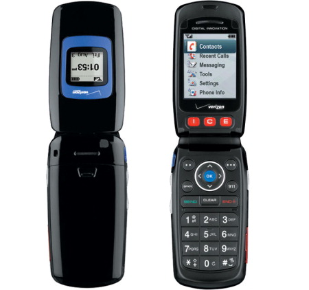
Caption: The Verizon Coupe phone.
When you open the phone, you find a lighted number keypad and a 176- by 220-pixel color screen. Below the display is a row of three letters in red, "I," "C," and "E," which stand for In Case of Emergency. Each letter represents a button that can be assigned to an emergency number of your choice. To assign the number, you press the key and follow the voice prompts. Below the hinge of the phone are the navigation buttons. They consist of two soft keys; a four-way toggle that doubles as four user-defined shortcuts; a middle OK key; and then the Send, Clear, and End/Power keys. There are also a dedicated Speakerphone key and a 911 key. The buttons below the I, C, and E keys and just below the hinge of the phone are actually the Menu buttons.
Display Screen Characteristics
The menu interface is easy to understand, with larger-than-usual fonts for improved legibility. You can adjust the dialing font for a larger size, and there is a backlight timer for the display.
The majority of text on the display screen is in 11-point font, including the splash screen, menu items, and text messaging. When highlighted, the items in the main menu expand to a 14-point font, and the items in the subsidiary menus (including contacts) increase to a 12-point font. Also, the dates in the calendar are normally 7-point, but increase to 11-point font when a specific date is selected.
Features
Aside from the emergency keys, the Verizon Coupe is a fairly basic phone. In fact, there is no multimedia messaging, no Web browser, no Bluetooth capability, and no camera, but this can be a good thing if these are features that you would not want to use anyway. However, the phone does have a 500-entry address book, with room in each entry for five numbers. Each entry can be assigned a ring tone and an alert. Other features of the Coupe include a Speakerphone, vibrate mode, text messaging, a calendar, an alarm clock, a world clock, a notepad, a stopwatch, and a calculator. You also have a choice of 10 wallpapers, two menu styles, and greeting banners. The phone is also TTY- and hearing aid-compatible. The Coupe has a rated battery life of 3.6 hours of talk time and 9.5 days of standby time.
A Coupe feature that is helpful to people with low vision is the spoken menus option. This feature reads aloud the highlighted menu item as you scroll through the menus. Unfortunately, this feature does not work on all levels of menus. As you go deeper into the menus, the reading aloud feature is not available, although the audio feedback does work with text messaging.
Another Coupe feature that is helpful to people with low vision is voice dialing. This feature allows you to say the name of a person whose phone number is stored in your Contacts list, and the phone automatically dials the number for you. By using this feature, you do not have to negotiate the on-screen menus visually and scroll through your Contacts list to find the name of the person you want to call.
User Manual and Documentation
The documentation for the Coupe is presented in an easy-to-understand format. This is especially true for the All the Basics You Need to Get Started booklet. The majority of its text and the text of the User Guide are presented in a 12-point font. The text of the Understanding Your Service manual is printed in 11-point font. While not large print by any standard, these font sizes are actually larger than those of the manuals of many other cell phones.
What Would Make It Better for People with Low Vision?
It is clear that Verizon has made an effort to offer a phone for its customers who may have some "special" needs. There are, however, aspects of the phone that, if modified, would better meet the needs of customers with low vision. Many will appreciate the larger fonts and spoken menus, as well as the more simplified interface and the fact that the phone offers basic features. While the Coupe is a step toward increasing accessibility, modifications could be made to increase the phone's usability and accessibility to people with low vision.
Physical Design
- The phone itself can be difficult to open, especially if a person has limited manual dexterity. I have no dexterity problems, but found the phone awkward to open. A protruding edge that is easy to find and feel would help a great deal.
- The charging jack on the side of the phone needs to stand out more visually and tactilely. If the jack cover were white, it would stand out better from the black phone. As it is, it is difficult to feel with your fingers and difficult to open. You need to use your fingernail to open the jack's cover. People who have reduced sensation in their fingers may not even be able to open the cover.
- The dialing pad of the phone is black, as is the phone, which can be a problem for people with low vision. In addition to having dialing buttons with large, labeled, backlit numerals, the buttons also need to contrast highly with their surroundings to make them easier to see.
- The Send, Clear, and End Call buttons are narrow and can be hard to press. A wide finger could easily press the wrong button.
- The 911 button is located close to the End Call button—too close, in fact. It would be easy accidentally to call 911 instead of pressing the button to end your call. Moving this emergency button to a more out-of-the-way place on the dialing pad would help ensure that customers would not press it inadvertently.
- While it stands out well both visually and tactilely, the volume rocker on the side of the phone is also very sensitive. Several times while using the phone, I inadvertently turned the volume up and down during a call.
- The I, C, and E emergency buttons can be confusing for some people, who may try to press them to activate the main menu. It may seem logical to some people because the I key is just under the word "Menu" on the screen.
- Another suggestion is to have tone feedback for the user when dialing buttons are pressed.
Screen Display Characteristics
- It is somewhat disappointing that the screen does not set to a high-contrast and large-font setting that you would think would be standard for baby boomers and elderly people; you can set up these options manually, but they are buried within menus. My question is this: Why not have then as the default? If you want the fonts smaller, make that the setting to change.
- A brightness setting would also be a helpful addition.
Features
- Having spoken menus available for all the menus of the phone, especially the Contacts list, would greatly increase the phone's accessibility to people with low vision. Many people with low vision appreciate, if not rely on, the auditory confirmation of the words they are trying to read on a phone's display screen.
User Manual and Documentation
- While the Quick Start and documentation are presented in an easy-to-understand format, and it is easy to look up information about the phone, it would be better if the print were in a larger font. The American Printing House for the Blind recommends at least an 18-point font for people with low vision.
- The icons that are used in the documentation to indicate particular buttons also need to be larger. The print in the picture of the buttons is smaller than the standard type and, thus, is harder to read.
- More specific instructions for entering information into the phone and text messaging need to be included in the Quick Start guide. This information also needs to be more clearly explained in the User Manual. Older persons and others who are unfamiliar with these tasks need more simplified instructions to understand and use these features.
The PANTECH breEZe from AT&T
Physical Description
Measuring 4 inches by 2 inches by 0.7 inches and weighing 3.4 ounces, the breEZe is a slim flip phone with a white pearlescent finish. There is a 1.04-inch diagonal screen on the outside that displays the date, time, and caller ID. Flip the handset open to see its three quick-dial buttons labeled 1, 2, and 3, which can be assigned for emergency or speed dial purposes. These buttons are set below a 2.2-inch 250k colors TFT LCD screen. The lighted keypad buttons are fairly large. On the side of the handset, there is a slender volume rocker and a charging port/nonstandard headphone jack.

Caption: The breEZe.
Below the hinge of the phone are the navigation buttons. They consist of two soft keys, a four-way toggle that doubles as user-defined shortcuts, a middle OK key, a Speakerphone key, and a Camera button. The dedicated Camera button is a helpful feature that eliminates the need to navigate through several menus to take a picture. The Send, Clear, and End/Power keys are at the top of the standard dialing pad, which is separated from the navigation buttons by the silver faceplate that surrounds the keypad area.
Display Screen Characteristics
The breEZe has two interfaces from which you can choose: Easy and Advanced. Both interfaces can be set to larger fonts for improved legibility, and there is a backlight timer and brightness adjustment for the display.
When set to large fonts, the majority of text is in 11-point font, which includes the text buttons at the bottom of the screen, the main menu items (when highlighted, these items become 13-point font), and texting. However, all menus that are accessed immediately after the main menu have item choices in 15-point font. The next level of item choices is in 11-point font. The only exceptions are the options under contacts and phone settings, both of which are in 9-point font. The date on the main screen is in 8-point font, while the time is in 14-point font.
Features
As I mentioned before, the breEZe has two interfaces from which you can choose. The Easy mode is a text-based menu interface that provides access to the most commonly used features. The Advanced mode uses an icon format for navigating the system and provides access to the advanced features.
The breEZe has all the features you would expect to find on a midrange phone. There is a calendar, calculator, VGA camera, photo and video albums, an alarm clock, stopwatch, business card setup, note pad, and voice memo, as well as text messaging, e-mail, and instant-messaging programs. The phone has 21.3MB of memory for pictures, ringtones, and games, and the Obigo web browser can handle basic Web pages. The phone also comes with several demo games and Bluetooth and TTY capabilities.
As I previously mentioned, the breEZe also has a Speakerphone and three quick-call keys that can be used for emergency or frequently dialed numbers. It offers 3 hours of talk time and 250 hours of standby time.
User Manual and Documentation
The Quick Start Guide for the breEZe is printed in an accordion-style fold-out brochure. Its main text is printed in 8-point font, and the gray-colored subtext is in 7-point font. There are also some "fine print" and disclaimers in 6-point font. The majority of the information and instructions in the User Guide are printed in 10-point font.
The Quick Start Guide and User Manual have small pictures, diagrams, and icons within the text that are not readable by many people with low vision, and the light blue and gray type does not provide sufficient contrast that many people with low vision need to read text.
What Would Make It Better for People with Low Vision
Physical Design
- The keypad buttons on the breEZe need to contrast better with their surroundings to make them easier to see. Black would provide a higher contrast and make the buttons stand out more sharply than does the gray faceplate that surrounds them.
- The headphone jack/charging port on the side of the phone needs to stand out more visually and tactilely. If the jack cover were black, it would stand out better from the white phone. The engraved icons on its cover are extremely small as well, and would not be visible to a person with even a minor degree of vision loss. As it is, the jack's cover is difficult to feel with your fingers and to open. You need to use your fingernail to open the jack's cover. People with reduced sensation in their fingers may not be able to open the cover to charge the phone.
- The three quick-dial keys below the screen need to contrast more sharply with their surroundings. For example, if they were black or red with white numerals, more people with low vision would be able to see them more clearly.
- If you are accustomed to taking pictures with a cell phone, it may take some getting used to with the breEZe because the camera lens is awkwardly placed. If you are not careful, you may cover it with your finger.
- The volume rocker on the side of the phone could be more tactile as well. A better tactile distinction between the Up and Down volume buttons would make the buttons easier to find and use.
- Placing a traditional nib at the center of the 5-key would assist users with orientation. This phone uses a raised line along the top of the 5-key. Because the raised line is located so close to the space between the 2- and 5-keys, it is more difficult to feel.
Screen Display Characteristics
- While the breEZe has a good-quality display, it is disappointing that the screen does not default to a large-font setting; you can set that option manually, but it is buried within menus.
- It seems odd that the items in the second layer of menus are actually larger than the items in the Main menu. I am all for making all fonts as large as possible in every situation. If there is room to make the letters larger, I say, "just do it." For example, even though the numbers that are displayed on the breEZe's screen while you are dialing are extra large, there is room on the screen to make them much larger. So why not make them larger?
Features
- Having spoken menus available for all the menus of the phone would greatly increase the phone's accessibility to people with low vision. As I mentioned previously, many people with low vision appreciate or rely on the auditory confirmation of the words that they are trying to read on the phone's display screen.
- Creating a phone in which you can select the level of features you want, either a basic or more advanced set of features, is an interesting idea and may work well for many. After they use the phone for a while and become more accustomed to it, some people may want to switch from the Easy to the Advanced mode. At the same time, if a person will use only the basic features, having two modes may make it more complicated and confusing if, for some reason, the modes setting becomes changed.
- The breEZe phone claims to be easy to use, and while I would not say it is difficult, I will say that it is no easier to use than most other phones with a moderate level of features.
User Manual and Documentation
- This phone is supposed to be for those who may want or need a phone with large buttons, larger screen fonts, and high-contrast displays. So, why is the Quick Start Manual, the document that you consult to get started using the product, printed in 6-, 7-, and 8-point font, which the majority of this phone's intended market cannot even read? The print definitely needs to be in larger fonts.
- The icons that are used in the documentation to indicate particular buttons also need to be larger. The print in the picture of the buttons is smaller than the standard type and thus is harder to read. Using light colors for text also makes it more difficult to read and should be avoided.
- More specific instructions for entering information into the phone and text messaging need to be included in the Quick Start Guide. This information also needs to be clearly explained in the User Manual. People who are unfamiliar with these tasks need simplified instructions to understand and use these features.
One other point I will be making in my upcoming articles is the need to have clearly labeled chargers for devices. We have so many chargeable gadgets today that it is difficult to be sure which charger goes with which device. All chargers for all devices need to be clearly labeled with large-print stickers to make it easier to keep track of which charger powers which product.
The Bottom Line
Verizon and AT&T have both taken steps to increase the accessibility and usability of their products for people who have aging eyes or some degree of vision loss, and their efforts are appreciated. I would encourage them to incorporate the suggestions in this article into future phones.
As the American population and its eyes age, there will be an increasing market and demand for phones with large fonts; high-contrast screens; and large, labeled buttons. It is important for phone companies to make sure that these types of phones are not only available, but properly promoted and publicized so people will know they are available.
When I went into my local Verizon store, the Coupe was not on display. I asked about it, and the sales clerk said that the store had a couple of Coupes in the back, but none on the store's shelves. In the local AT&T store, the breEZe was on display, but in the back corner.
If you are in the market for a cell phone with these types of features, definitely check out the Coupe and breEZe. Be proactive and ask for these phones by name; also ask to see other phones with similar features. Ask the sales clerks to set the large fonts setting and any other settings, such as brightness or contrast, that may help you better read a phone's screen before you decide to buy a particular phone.
At the time of publication, we learned that the Coupe is being phased out of Verizon's product line. It is being replaced by the Samsung Knack, which has similar features.