Reviewing Charts and Graphs with SAS Accessibility
From elementary school to post-doctorial, if your studies involve compiling, comparing, or manipulating numbers you will likely wind up using SAS, a computer platform that facilitates all manner of numerical analyses. Many SAS data sets are displayed using charts and graphs. Sometimes the presentations also include the original numbers in accessible text tables or spread sheets—but not always.
On those occasions when the raw data is available, students with visual impairments can scan the values cell by cell, attempting to "see the forest one tree at a time." Is the tallest tree in the forest twice or five times as tall as a tree of average height? Are there more trees at the south end of the forest or the north? Factors such as these can be gleaned at a glance by sighted students. For those with visual impairments, not so much.
Happily, several years ago, developers led by SAS Director of Accessibility Ed Summers began looking for ways to make charts and graphs more accessible to the vision-impaired—not just their own charts, but others' as well. They've made some recent enhancements. Let's begin with a look at their progress. Or should we say a listen to? Then we'll follow up with an overview of SAS accessibility in general.
SAS Graphics Accelerator
SAS Graphics Accelerator is a browser extension that enhances SAS graphs and charts with text descriptions, tabular data, low-vision support and interactive tonal feedback, known as sonification. Download and documentation links for the extension can be found at the SAS Graphics Accelerator customer product page. The extension is available for the Chrome browser on both Windows and Mac. Note: Other platforms may be supported in the future. The Chrome Web Store includes a "Getting Started" video.
Once installed and enabled, the extension adds a SAS Graphics Accelerator tab to the main Chrome menu bar. Now, whenever your browser encounters a SAS enabled chart or graph, a chime will sound, and an "Accelerate" button will be added to the bottom of any figures on that page.
The SAS support page offers several sample SAS Graphics Accelerator enabled chart types, including a sample pie chart, bar chart, histogram, box plot, heat map, series map, and bubble plot. You can also access these samples via the Laboratory in SAS Graphics Accelerator, a local repository for your personal data and charts accessed via the browser's extension menu bar.
Like all accessible charts and graphics created by SAS, each of these samples includes an "Accelerate" button at the bottom of the figure. Invoke this button and you are offered the following functionality.
Description
This option provides a text description, including graphic type, title, X- and Y-axes labels and information.
Visualization
Visualization allows users to render graphs using a visual theme that has been optimized for low vision users. The data that was used to create the graph can be saved in the user's laboratory account for later recall by opening the lab. The graph or chart can also be shared. The visualization option is ideal for sharing work with sighted classmates or instructors, or for instructors sharing charts with visually impaired students.
Sonification
Sonification allows the user to "play" the graphic, with rising tones for higher values and falling tones for lower values. The tones are played in stereo, with the left edge of the figure playing through the left speaker, then moving to the right within the sonified data set. The entire data set can be played using various speed options, or navigated incrementally using the arrow keys to hear the tones element by element, "sonifying," or voicing the numerical data or both. Several options, such as sonification speed and verbosity, can be set using the extension's Setting menu. Single-key shortcuts have also been included, conveniently located on the left side of the keyboard so the user can use the right hand to cursor and the left to change settings on the fly. Note: In order to use sonification you may need to turn off the virtual cursor in JAWS (Insert + Z) or Forms Mode in NVDA (Insert + Spacebar). Possible shortcuts vary with chart types, but the H "Help" shortcut will list all the available shortcuts. Needless to say, sonification is easiest to comprehend when there is only a single variable on the X-axis, but other, more complex chart types can also be explored using sonification. Heat maps, for example, are often color-coded and thus difficult to interpret using a screen reader. We won't go into details here, but see the end of this article for a step-by-step guide of sonification and the sample heat map showing MPG City by Weight chart as described by Ed Summers.
Data
The data option offers the user the chart or graph data in a tabular format. The data can be navigated using screen reader table commands, or saved to the laboratory, where the labels and data can be edited. The data can also be exported as a CSV Excel-compatible file.
Extracting Tables
Some websites offer a link to a table version of information they have presented in chart format. Other times you may encounter a site that has presented a table of information for which you'd like to receive low-vision support or sonification. This can be done via the "Extract tables from this page" option. This option extracts data tables from webpages and offers the opportunity to create a chart (bar chart, pie chart, scatter plot, etc.) enabled for SAS.
As an example, take this NASDAQ table that compiles the dividend history for WP Cary (WPC), a real-estate investment trust. With the page displayed in Chrome, invoke the Extract Table option from the SAS menu bar. You can now save the table to the Laboratory in SAS Graphics Accelerator or create a chart, which you can also save to the laboratory. Below is a low-vision enhanced version of this chart. If you have SAS Graphics Accelerator installed, you can activate this link to explore the chart, read a text description of the chart, or use sonification to explore the data. If you do not have the extension installed, use this link to play a recording of the sonification.
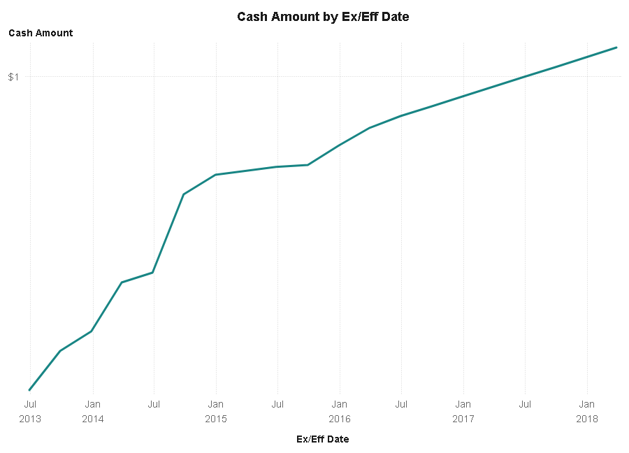
Caption: Time series plot showing dividend titled "Cash Amount by Ex/Eff Date."
You can also import CSV or Tab- or comma-delimited text files, any of which can be created using Excel, Numbers, or other spreadsheet software. You can update the data at any time and refresh the chart, then re-accelerate it.
SAS Studio
So far we've discussed how to navigate and create charts and graphs enabled for SAS. SAS is a powerful platform for data crunching, however, and if you are studying math, science, even geography, you may need to learn to use SAS to further your studies. Most of this work can be done in SAS Studio, a web-based interface used to analyze data. Primarily, you do this by writing programs in the SAS programming language and then running those programs. SAS Graphics Accelerator is integrated into SAS Studio. This means a visually impaired student or lifelong learner can compile or import a data set, create and run a SAS program, then access and explore the resulting charts and graphs interactively using the software's low-vision features and sonification.
SAS Studio offers an accessibility page where you will find a narrative tour of the SAS Studio workspace layout, recommended settings for optimum screen reader use, and a table list of keyboard shortcuts for the various commands and functions.
Learning SAS
SAS offers a series of free e-learning courses, including SAS Programming 1 and Statistics 1. The tutorials are delivered as videos, however there is a text transcript for each video that contains both the spoken content and the SAS code and results that are displayed during the video. These transcripts enable a visually impaired student to experience and complete the video courses using a screen reader, magnifier, or refreshable braille display.
Accessing SAS Studio
There are two ways students and lifelong learners can access SAS Studio, and both are free for individuals.
SAS OnDemand for Academics
SAS OnDemand for Academics gives access to SAS Studio over the web without installing any software to students, instructors, or independent learners. Simply log onto the SAS OnDemand for Academics customer page, select your learning path, and register. Once registered, you can access SAS Studio through the SAS control panel.
SAS University Edition
SAS University Edition allows you to access SAS Studio on your own PC or Mac without an internet connection, though you will need one to get started. SAS University Edition comes in the form of a pre-configured virtual machine that runs on your PC or Mac using Virtual Box for Windows, VMFusion for Mac, or VMware Workstation Player for either. The VM Workstation Player has been tested with accessibility, and is the option recommended for screen reader users by SAS documentation. Enable this virtual machine and SAS Studio runs a local web server, to which you can connect using the same computer's screen reader-enabled browser.
SAS University Edition VM can be tricky to install using a screen reader, but there is a SAS University Edition Quick Start Guide for Students With Visual Impairments that offers step-by-step instructions on installing and engaging the virtual machine using JAWS. This document does need to be updated, however. It refers to Windows 7, and JAWS 17, with no mention at all of NVDA.
SAS also offers accessibility support via email.
Sonification and Heat Maps
A simple line or bar chart is easy to access with sound using SAS. Other charts require more practice. Below, Ed Summers will take you through the process of accessing a heat map using SAS Graphics Accelerator. We saved this for the end of the article to give you a chance to locate and install the extension.
From SAS Director of Accessibility Ed Summers:
Heat maps are used for the same purpose as scatter plots: to understand the relationship between two continuous variables. The two variables are represented on the x- and y-axes. Typically, the independent variable is represented on the x-axis and the dependent variable is represented on the y-axis.
You would use a heat map rather than a scatter plot if your data set is large. For example, if your data set includes thousands of data points, the points may pile up on top of each other in certain areas of the plot, and you would not be able to distinguish between dense areas of the plot visually or tactilely on a tactile graphic. In other words, once an area reaches a certain level of density, it becomes impossible to perceive additional density.
The heat map solves this problem because it divides the Cartesian plane into a grid. The color of each cell is dictated by the number of data points in that cell. For example, a cell with zero data points may be light blue, a cell with the most data points may be dark blue, and the other cells are some shade of blue in between.
We refer to the number of data points in each cell as the z-axis value where the z-axis is a third dimension in addition to x- and y-. Think of the z-axis as the height of textures on a tactile graphic.
The audio representation of the z-axis value is a pssst or whoosh sound. I think it sounds like a puff of air escaping from an air hose. The pitch of the sound represents the number of data points in the corresponding cell in the heat map. A low pitch or air pressure is a small number of data points, and a high pitch or air pressure is many data points.
As always, the thump sound represents an empty cell. The piano sound represents the height of the data point on the y-axis. And the position of any sound between the left and right speakers represents the position of the cell on the x-axis.
Press the R key to toggle between the y- sound and the z- sound. You can listen to each of them independently or turn both of them on so they play simultaneously.
I typically explore heat maps using the following methods:
First, I play each column as a chord to get an overall sense of the relationship between the two variables. Follow these steps in sonification view:
- Press C until you hear "off." This turns off speech so you can focus on the sonification sounds.
- Press S until you hear "Row or column by chord."
- Press R until you hear "y-axis." Now, you will only hear the piano sound for each cell that contains data. The pitch of the piano sound tells you the height of the cell on the y-axis, and the position between the left and right speakers tells you the position of the cell on the x-axis.
- Press Control + Left Arrow to move to the column on the far left.
- Press Shift + Right Arrow to play every column from left to right.
- Repeat steps 4 and 5 to hear it again or just press Shift + Left Arrow and then Shift + Right Arrow to scan back and forth from left to right.
- Press D repeatedly until you hear "slow" or "slowest" to slow down the speed if you need to.
- Now, press R until you hear "z-axis." That will play only the z sounds so you can get a feel for the density of each column.
Second, I now explore each row as a melody. That fills in some of the gaps regarding z values:
- Press S until you hear "Row or column by melody."
- Press R until you hear "z-axis."
- Press Down Arrow to move down by row until you get to the bottom and then press Up Arrow to go back to the top.
- Press D to adjust speed as needed.
Third, when I find a row that contains data that needs additional exploration, I explore by cell:
- Press S until you hear "cell by cell."
- Now, press any of the Arrow keys to move one cell in any direction.
- Press C to toggle speech settings as needed.
- Press R to toggle between y-axis and z-axis sounds as needed.
Using the methods above, you should be able to quickly determine that there is an inverse correlation between weight and miles per gallon in the heat map on the sample page. Also, you should be able to determine that the densest cell in the heat map is at 3,500 pounds and 20 miles per gallon.
Related articles:
- Accessible Investing with the Robinhood App from Robinhood Markets, by Bill Holton
- SEE3D: Teenagers Expand the Visual World for People Who Are Blind, by Deborah Kendrick
More by this author: